The project Dashboard
The Dashboard is a project's synthetic control panel: it gathers on one page blocks (indicators, charts, tables) that give an immediate view of progress, workload and budget. You reach it from the Dashboard menu in the project sidebar.
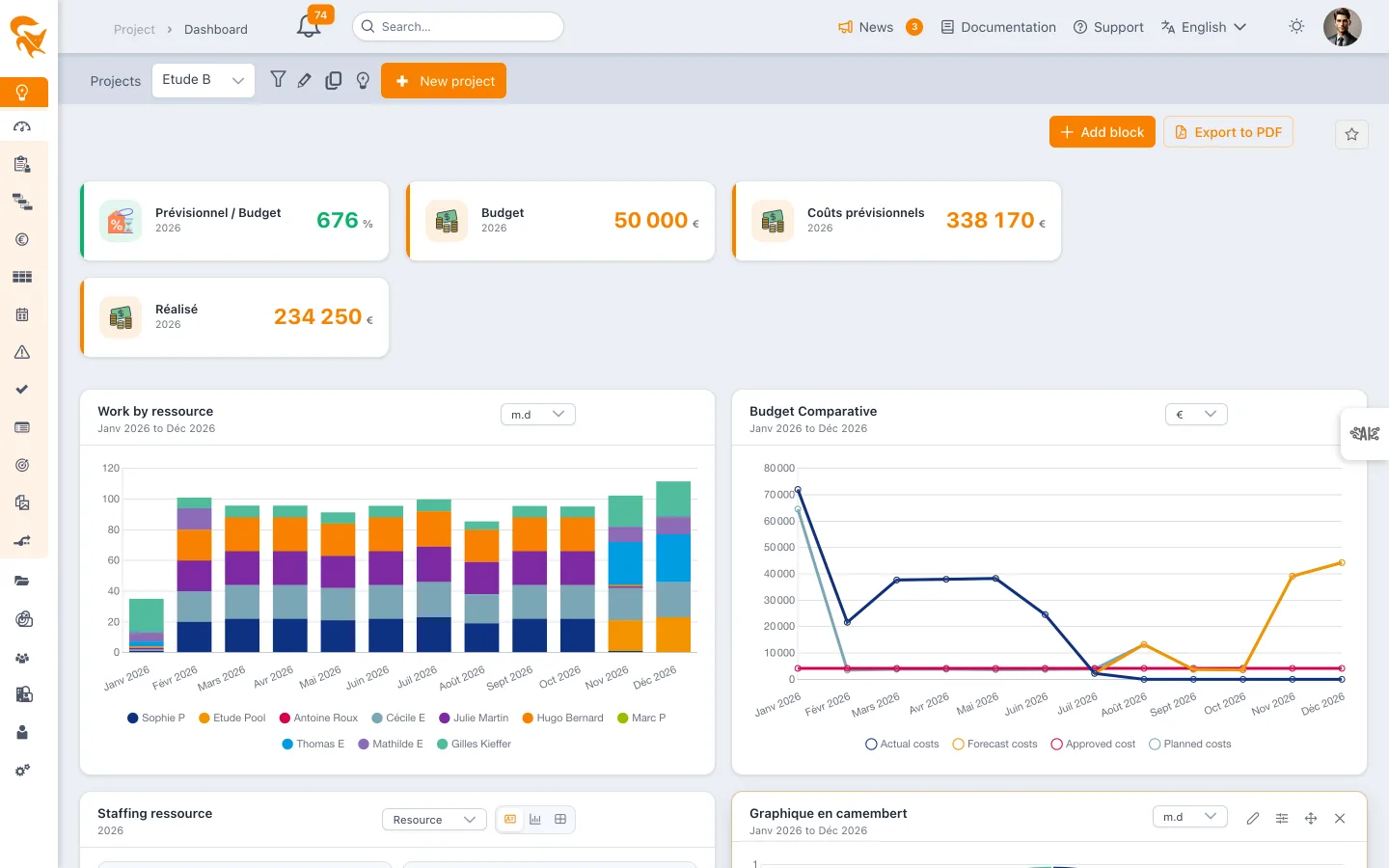
The dashboard is fully modular: nothing is imposed, you assemble the blocks you need. The layout is saved automatically as you edit it.
The dashboard shipped when the project is created
A brand-new project does not open on a blank page. It receives nine blocks right away, in its creator's language:
| Block | Type | Content |
|---|---|---|
| Progress | Tag | The overall % complete of the project |
| Project weather | Tag | The overall indicator of the latest weather report |
| Forecast / Approved | Tag | The ratio of forecast costs to approved costs, over the current year |
| Approved budget | Tag | In currency, over the current year |
| Actual budget | Tag | In currency, over the current year |
| Work by resource | Stacked Bar | Monthly workload, broken down per person |
| Budget comparison | Line | Actual, forecast, approved and planned costs, month by month |
| Deadline tracking | Table | The tasks whose finish goes past the set deadline |
| Cards progress | Classic | Open, in-progress, done and late cards |
This dashboard is a starting point, not a fixed template: every block can be renamed, moved, reconfigured or removed, and others added. The same set of blocks is laid down when a project is cloned and on a bulk import.
The same content is also shipped to the workspace as a shared favorite — "Project dashboard (default)" — assigned to the default groups: any project whose dashboard is empty displays it right away, and everyone finds it in the favorites menu. See Default dashboards.
The action bar
| Action | Effect |
|---|---|
| Add block | Opens the 3-step creation wizard (block type → content → configuration) |
| Open draft | Switches to draft mode: changes are no longer saved |
| Export (download icon) → Export to PDF | Generates a printable image of the whole page |
| Export (download icon) → Export to PowerPoint (.pptx) | Generates an editable PowerPoint presentation: indicators as cards, charts as native PowerPoint charts |
| ★ Favourites | Saves / reloads a named dashboard layout |
Adding a block
Step 1 — The block type
| Type | Use |
|---|---|
| Tag (indicator) | A single value and its unit: budget, margin, % complete… |
| Line | Evolution over time of one or several dimensions |
| Bar | Period-by-period comparison |
| Stacked Bar | Breakdown of a total (typically workload by resource) |
| Pie | Distribution over a period, with no time axis |
| Classic | Resource staffing and task tables |
Step 2 — The content
Choices are grouped by family — Tracking, Costs, Revenue, Margins, Ratios, Planning, Resources, Cards, Risks — and each comes with a sentence saying what it measures (for example Planned costs: “Derived from resource allocations on tasks”). Budget dimensions always read from approved to actual. A search field filters the list; it also searches these explanations: typing “time entries” finds the actual dimensions.
For a chart, the choice is made through two tabs:
- By dimensions — tick one or several budget dimensions; each becomes a series of the chart. This is how you build a budget comparison, by ticking for example Approved cost, Forecast costs, Planned costs and Actual costs.
- By resources — one series per resource (workload in cost or in revenue).
Available dimensions:
| Family | Dimensions |
|---|---|
| Costs | Approved cost, Forecast costs, Planned costs, Actual costs |
| Revenues | Approved revenus, Forecast revenus, Planned revenus, Actual revenus |
| Margins | Approved margin, Forecast margin, Planned margin, Actual Margin |
For a tag, choose the value to display: one of the dimensions above, a ratio (Forecast costs / Approved cost, Forecast revenus / Approved revenus), the project weather, the overall progress or the Number of resources — the people allocated to at least one task in the scope (leave does not count; on a team dashboard, only team members are counted).
For a classic block, choose between Resource staffing and the tables: Task list, Milestone list, Tasks and milestones list, Deadline tracking, Tasks with a predecessor in another project.
The Task list and Deadline tracking blocks carry a Tasks · Cards · Both selector at the top. By default they list the planning tasks; on Cards they track the stories, bugs and sub-tasks of the scope with the same ordering rules; on Both the two are mixed and a small icon marks the cards. A closed card counts as done. The choice is saved with the block: it survives a reload and follows the block into a favorite.
Step 3 — The configuration
This screen determines over which period and in which unit the block is computed.
| Setting | Detail |
|---|---|
| Unit | € (the workspace currency) or m.d (man-days) |
| Period type | Month, Year or Variable |
| Cumulative values | Displays the series as running totals (see below) — time-based charts only |
| Month granularity | On a period in years, splits the axis month by month instead of year by year |
Depending on the period type:
- Month — From month … / to month … bounds
- Year — From year … / to year … bounds
- Variable — the period is recomputed every time the dashboard opens, relative to today's date. You define it with a time unit (Month or Year), an operator and a number of periods:
| Operator | Resulting period |
|---|---|
| Current | The current month or year |
| Previous | The N periods before today |
| Next | The N upcoming periods |
| Previous and next | The N past periods and the M upcoming ones |
A variable period saves you from reconfiguring the dashboard every year: Year / Current always shows the current financial year, Month / Previous and next 3 and 3 keeps a sliding window around the present month.
Cumulative values
The Cumulative values option turns each series into a running total: every point carries the sum of all the points before it. The curve becomes monotonically increasing — the classic S-curve of project tracking.
- Without cumulation — the consumption of each month. You read activity peaks and quiet months.
- With cumulation — the total consumed since the start of the period. You read the widening gap between budget and actuals, and the last point of each curve equals the period total.
The typical use is a Cumulative Budget block: a line chart with the four cost dimensions and the option ticked, next to a non-cumulative Comparative Budget. The first shows the trajectory, the second the pace.
The option is available on line and bar charts (simple or stacked), for month periods as well as year periods. It makes no sense on a pie chart, which has no time axis, and is therefore not offered there.
Managing blocks
Hovering a block reveals an icon bar:
| Icon | Action |
|---|---|
| ✕ | Delete the block |
| ☰ | Move the block by drag and drop |
| ✎ | Reopen the configuration screen (period, unit, cumulation) |
Each block title can be edited inline: hover it, click the pencil, type the label of your choice and confirm with the green tick. This is how you name a block Comparative Budget or Cumulative Budget.
Charts additionally offer a unit selector (€ / m.d) in the top-right corner, which recomputes the block without going back through the configuration.
The Resource staffing block has its own grouping — by Resource, Department, Team, Position, Profile or Company — and three displays: table, chart and cards.
Draft mode
As for the budget, a draft lets you work on a copy of the dashboard without saving the changes — handy to prepare a presentation or a one-off export.
- Open draft: changes are no longer persisted.
- Close draft: back to the real data.
Favourites
The ★ control saves the current layout under a name. You can keep several dashboards for the same project — a "budget tracking" one, a "steering committee" one — and switch between them.
A favourite can be shared with the other users of the workspace. A shared favourite you do not own opens in read-only mode: you can manipulate it on screen, but your changes overwrite neither the favourite nor your own dashboard.
Exporting
The download icon, left of the favorite, offers "Export to PDF", which generates a printable version of the dashboard, ideal for a steering committee or a periodic report.
It also offers "Export to PowerPoint (.pptx)", which produces a presentation ready to show and editable: a cover (title, project or portfolio, date), a slide of indicators (one card per tile, values rounded as on screen), then one slide per block. Bar charts (plain or stacked), line, pie and doughnut charts become real PowerPoint charts with their data: you can recolour or complete them in PowerPoint. The other blocks (bubbles, weather, risk matrix, burndown, tables) are included as images, without the card's buttons.
See also
- Portfolio dashboard — the same tool, at portfolio scale
- Budget management — the budget data displayed in the blocks
- Planning — the planning that feeds workload and progress
- Project weather — progress reporting through indicators
Build a stable dashboard for recurring tracking, and use the draft for one-off views (e.g. a budget focus for a committee) without altering the reference layout.